A brand can have a perfect logo and still feel like a stranger to itself. The photos look like stock. The campaign uses a font no one chose. The social grid is a different brand entirely. What's missing isn't design — it's direction. Art direction is the discipline that makes everything sound like the same voice.
What art direction actually is
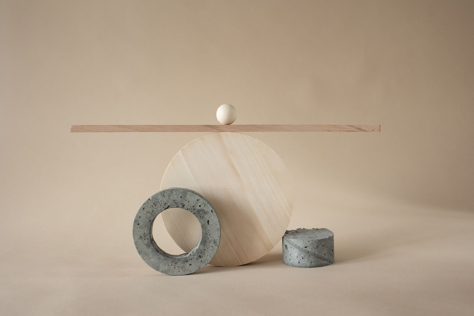
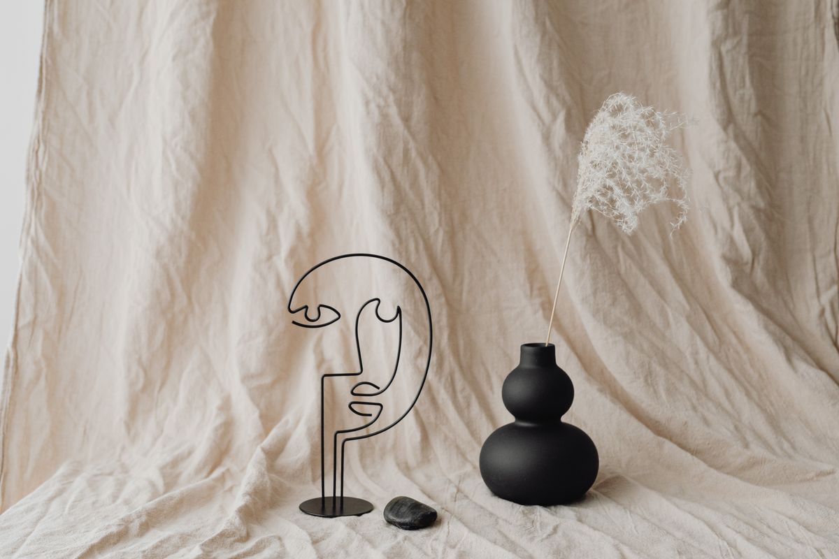
Identity sets the rules; art direction applies them with taste. It's the decision about how a photograph is lit, how much space a headline gets to breathe, whether the mood is warm or cool, calm or loud. Two brands can share the same palette and feel completely different because one has direction and the other doesn't.
It lives in the choices, not the assets
You can't buy art direction by commissioning more assets. A hundred beautiful images with no through-line still look like a hundred images. Direction is the connective tissue — the consistent angle, the repeated framing, the shared restraint — that makes a viewer feel they're looking at one place, one point of view.
Consistency isn't sameness. It's a recognisable point of view applied to new things, again and again.
How we direct
Before a single shot is taken or a layout is built, we agree the references, the mood and the rules — what's in and, more importantly, what's out. Then we hold the line. The hardest part of art direction isn't the first beautiful image; it's making the fiftieth one still feel like it belongs.
Get it right and the payoff is real. Campaigns stop looking like a committee made them. Social finally matches the website. And the brand starts to feel like a person you'd recognise across a room — which, in the end, is the whole point.